
On April 21, 2015, Google began changing its mobile search algorithms to favor mobile-friendly websites over desktop-only websites.
Since the advent of the iPhone in 2007, the first Android smartphone in 2008, and the introduction of the iPad in 2010, mobile devices have changed how people everywhere use the Internet. In less than 7 years, two thirds of Americans owned a smart phone, and last year it is believed the number of mobile searches surpassed the number of searches carried out on a desktop computer! Globally, mobile devices carry out about 30 percent of all Internet activity.
As a result of this trend, Google announced that starting on April 21, 2015, it will begin shifting its search algorithm to favor mobile-friendly websites over desktop-friendly websites in mobile search. From the Internet chatter over a week after this change began, this hasn’t resulted in a seriously huge loss in traffic for non mobile-friendly sites, but this is a significant issue to be aware of.
From personal observation, I can attest that a great deal of websites, including popular news sites, have yet to be made mobile-friendly. The growing trend of searches increasingly happening on mobile devices, along with the shift in Google’s mobile search algorithm could be turned into a competitive advantage for smaller organizations who can adapt more quickly. Conversely, organizations that put off overhauling their website could lose significant mobile traffic if they don’t take action soon.
While it’s true that many mobile devices have a great deal of screen real estate, this is no reason to expect this problem will solve itself! Whether Google directs less traffic to your site or not, most non mobile-friendly sites are super-cumbersome to use on a smartphone and some parts may not work at all. Were competitors to make the shift, you could quickly find that mobile users jump off your site before it even finishes loading because it’s really that easy to figure out the experience is not going to be worth the trouble.
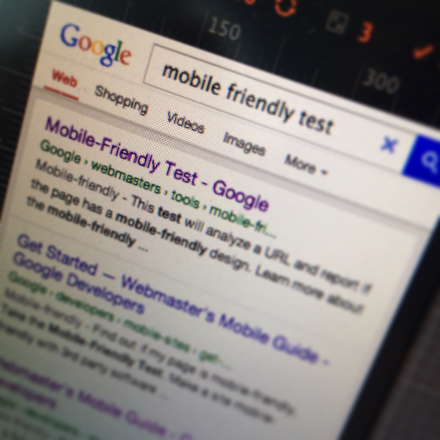
So to prove your web designer is truly awesome, or to encourage you to start planning for the future, put your website to the test. Since some sites may seem mobile-friendly, but not actually be mobile-friendly to Google, they’ve set up a Mobile-Friendly Test that scans your site here. Know also that Indoor360 panoramas and virtual tours are always built to be responsive, displaying attractively and working well on any device, from smartphone to desktop.
I know I thought my sites were all mobile-friendly, but it sure did feel good to have Google agree with me! Go check yours out and then send your web designer a note of thanks or a query for help on how to get started on improving your site.